In another post, we explain what joblessness is and why we use it on this platform. With this post we show how to get into the data on joblessness, and we cover some major takeaways.
Getting to joblessness
Since joblessness is one of our most important economic indicators, it can be found on the Economic Conditions Dashboard.
On this dashboard, you can see all of the indicators we’ve gathered, including joblessness.

When you’ve selected “Joblessness,” you’ll be shown the map and graphs based on the data.
Exploring the data
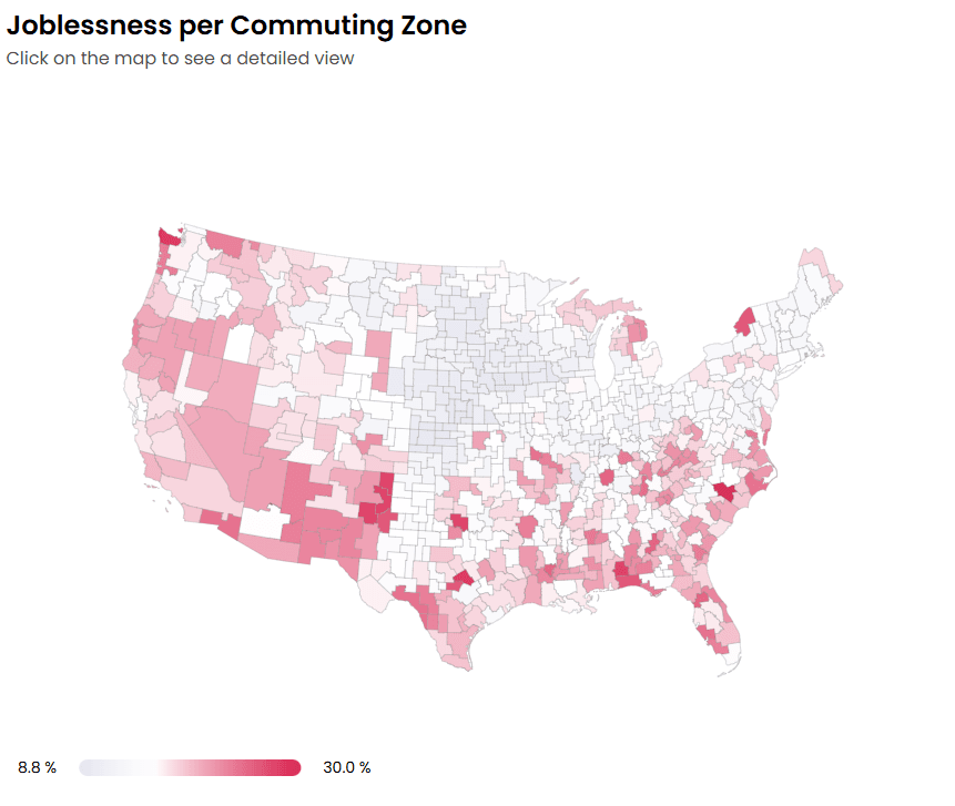
The first thing to notice is the map which shows differences in joblessness around the country.
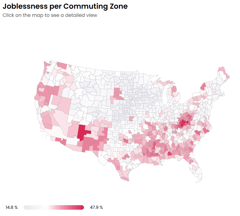 Joblessness - 2023
That map shows that joblessness is especially concentrated in a few specific regions, mostly Appalachia, the South, and the Southwest.
By default, the map shows the most recent year in the data (as of the writing of this post, that is 2023). You can change the year with the dropdown menu in "Step 1: Select time frame and measure" above the map. For example, you can change the "Condition in" to 1980 to see joblessness levels in 1980.
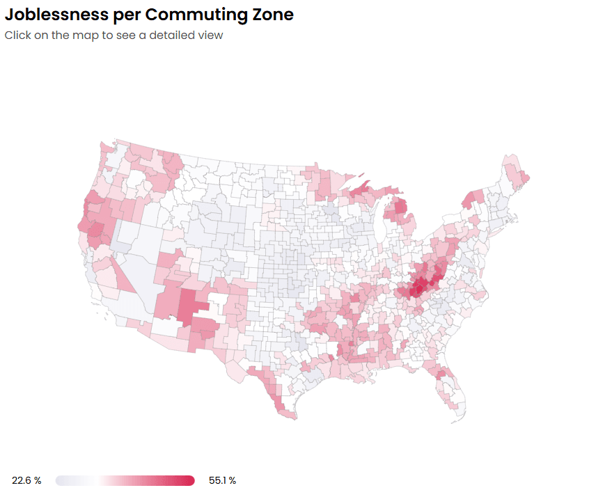 Joblessness - 1980
Comparing the map from 1980 to the map from 2023 reveals that joblessness is highly persistent. Although there is some change from year to year, for the most part the same regions which had high joblessness in 1980 still do in 2023.
Going back to the 2023 data, we can look at the joblessness rates for the top and bottom 10 commuting zones (CZs).
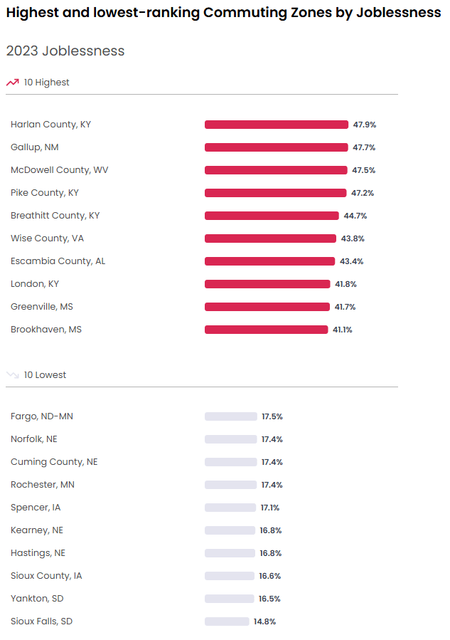
Two things stand out from this graph. First, CZs differ a lot in their rate of joblessness. The lowest is 14.8% and the highest is 47.9%. That means the joblessness rate in the highest CZ is more than three times the rate in the lowest CZ. Second, the level of joblessness is very high in the highest CZs. The top few CZs have joblessness rates around 50%. In other words, only half of working age adults in those CZs have a job.
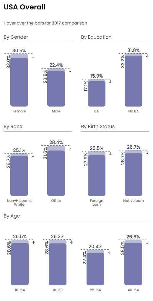
To the right of the map, the joblessness rate is broken down by demographics like gender and race.
 Joblessness - 2023
By far the biggest demographic factor in joblessness is a college education. People without a BA degree have twice the rate of joblessness as those with one (15.9% versus 31.8%).
Using "Step 2: Filter data" above the map, you can restrict the data to only those with a BA by selecting "BA" in the "Education" dropdown menu. When you do, you'll see that the highest joblessness rate for people with a BA is 30.0%. In other words, the highest rate of joblessness for people with a BA is lower than the average rate of joblessness for people without a BA (30.0% versus 31.8%).
 Joblessness - With BA - 2023
Takeaways
These facts about joblessness may not be surprising to people interested in economics in America, but they reveal an important truth: joblessness is not self-correcting. There are a couple reasons to think it could be self-correcting: people might be able to move out of places with high joblessness into places with low joblessness, and businesses might invest in places where there are many available workers and lower wages. However, as we discuss in our introduction to "place" in economics, these things didn’t happen. Instead, the people who moved out of places with high joblessness were the ones with the most earning potential — especially people with college degrees. The places they left behind thus became less attractive for business investment. So, large regional differences in joblessness have persisted over many decades.