How has energy-related employment evolved over time across the United States? What do these workers earn? Which places could generate the most electricity from solar and wind? Where have power plants expanded or closed?
The Energy Economy dashboard on the Economy in Place provides data to help answer these and other questions about energy across the United States. It combines various government datasets on the energy workforce and electrical generation to provide community-specific information related to the energy transition. This can help policymakers navigate the opportunities and challenges associated with a shift to cleaner energy sources.
Energy employment
The first two tabs on the dashboard provide information about workers in sectors of the economy that either produce energy or consume it most intensively (we don’t yet include jobs related specifically to renewable energies, since they don’t appear in the surveys that form the basis of our data). This sheds light on the potential labor market impacts of the energy transition at a local level as well as trends already experienced since 1980. Information is broken out based on workers’ gender, education level, race, birth status, and age.
The energy sectors included on the dashboard together make up 6.2% of total US full-time employment, or about 1 in 16 full-time jobs. Over half of this was in sectors related to automobiles--one of the main consumers of US energy. The share of total US employment in energy has decreased slightly from 2017 (when it was 6.5%), which was close to their 2010 share (6.4%) but a steep drop from their 10.8% share of US employment in 1980.
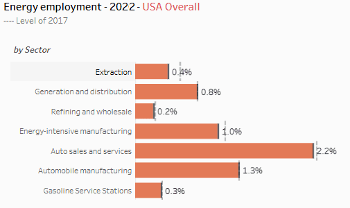
By default, the dashboard focuses on energy-related sectors that face the clearest negative impacts from declining fossil fuel usage. Together, these sectors make up 1.4% of US employment. Each sector is made up of several industries.
- Extraction: Oil and gas extraction; Coal mining; Support activities for mining
- Generation and distribution: Electric power generation, transmission and distribution; Electric and gas, and other combinations; Natural gas distribution; Pipeline transportation
- Refining and wholesale: Petroleum refining; Miscellaneous petroleum and coal products; Petroleum and petroleum products merchant wholesalers
The dashboard also includes data on sectors that consume large amounts of energy or are otherwise strongly linked to the use of fossil fuels, which make up 4.8% of employment:
- Energy-intensive manufacturing: Fiber, yard, and thread mills; Pulp, paper, and paperboard; Industrial chemicals; Clay products; Glass products; Cement, concrete, lime and gypsum; Iron and steel mills and steel products manufacturing; Aluminum
- Auto sales and services: Automobile dealers; Automotive parts, accessories, and tire stores; Automotive repair and maintenance; Car washes
- Auto manufacturing: Tires and inner tubes; Motor vehicles and motor vehicle equipment; Motor vehicles and equipment (wholesale trade)
- Gasoline service stations
Energy earnings
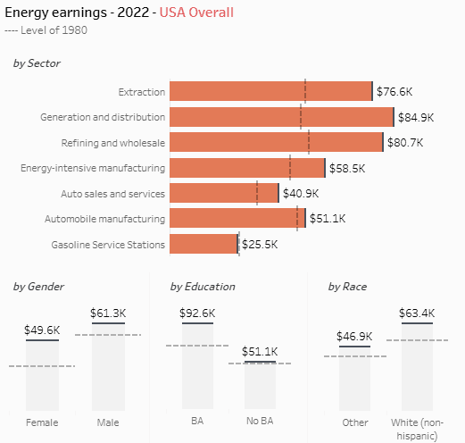
The platform also includes data on wages and salaries for full-time workers in energy-related sectors. Earnings have increased across all sectors since 1980 (adjusting for inflation), with the largest increases in generation and distribution industries and stagnant earnings in gasoline service stations. Income has mostly increased, however, for college-educated energy workers, with very minimal increases for those without a 4-year postsecondary degree. There also remain large gender and racial earnings gaps among energy workers.
Renewables energy production
In addition to information on energy workforces, the platform includes data on the volume of electricity that could be generated in each commuting zone from solar or wind. This is based on data from the US Department of Energy National Renewable Energy Laboratory on the annual “technical generation potential” (in megawatt-hours) of each county based on their typical wind speed and solar exposure, land availability and interconnection potential.
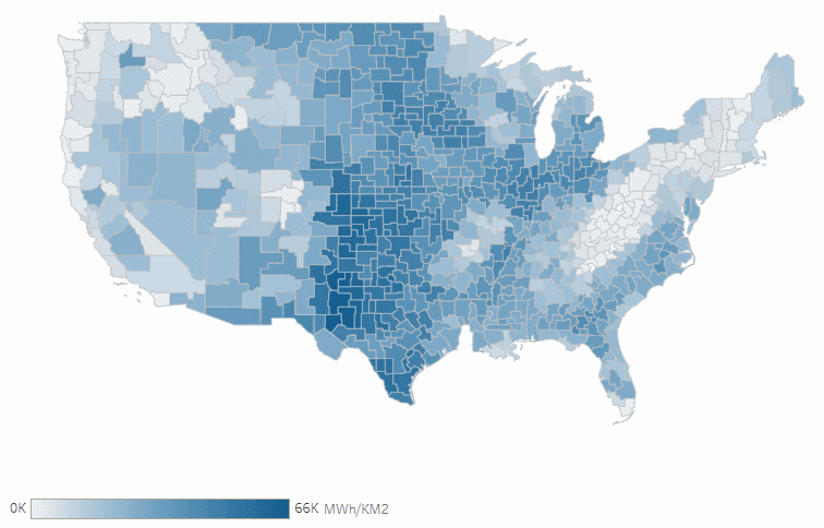 Solar energy potential per square kilometer.
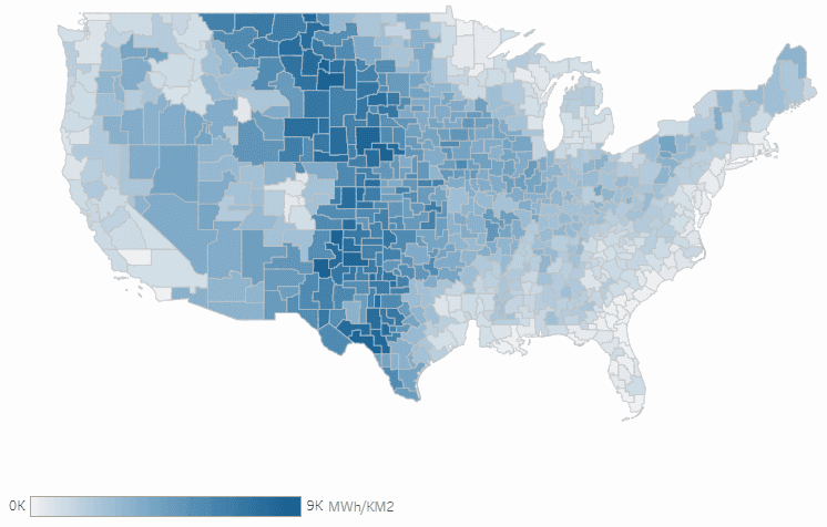 Wind energy potential per square kilometer.
Across both types of generation, renewables potential (per square kilometer) is largest throughout the center of the US. Overall, there is nearly ten times as much potential generation from solar than from wind across the entire continental US. Solar potential is largest in the southern Great Plains: parts of Kansas, Colorado, New Mexico, and Texas (including several commuting zones with high energy employment). Wind generation potential is high in many of these same areas, as well as in upper Great Plains and Mountain West including areas of Montana, Nebraska, and Wyoming.
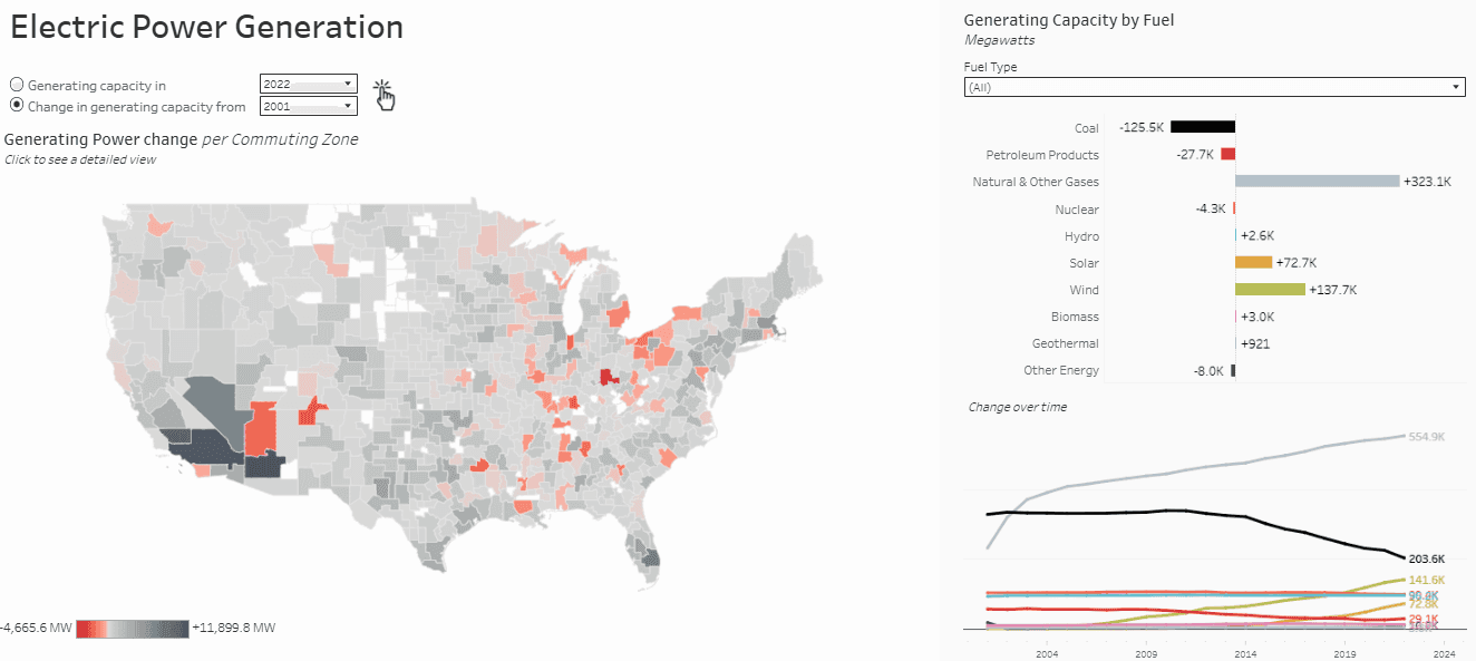
Electrical generation capacity
The final dataset on the platform is the volume of electricity generation capacity--the maximum that power plants in each commuting zone are capable of generating at a given time--between 2001 and 2022, using data from the US Energy Information Administration. Generation capacity is further broken out by fuel type.
The data show a large decline in coal-fired electrical generation capacity over the past two decades, as well as much smaller declines in petroleum and nuclear-powered electricity. Over the same period, total capacity to generate electricity from natural gas, solar, and wind have all increased drastically. This is largely due to the advent of shale gas, technological improvements, and policy changes. As a result, total installed electricity capacity has increased by 374.5 gigawatts (or thousand megawatts) since 2001. However, the overall increase masks substantial local variation. While growing population centers such as Phoenix and Las Vegas have built out power plants, generation capacity has decreased around much of the Great Lakes and parts of the Ohio River Valley, as well as in other commuting zones across the US. While integrated grid networks may lessen the impacts of these regional imbalances, transmission network constraints mean that areas with greater electrical generation capacity could benefit through lower retail prices and by more easily attracting energy-intensive industries.
These are just a few examples of the data available on the Energy Economy dashboard. Users can explore the detailed and geographically granular data on the dashboard themselves to better understand the past and present of energy in the US and how regions may differentially experience the energy transition.